


Q magazine analysis: |
| This double page spread layout is common with Q magazine. The large image on the left is of Lady GaGa, this the audience are told in the top right corner. The image is provocative due to her posing in a medium close up looking directly into the camera with a large number of necklaces on with her hands coving her breasts. The written article on the right and the large letter of Lady Gaga's first letter overlaps the article over the main body of the text. I have noticed from seeing other Q magazine articles that the often overlap the first letter of an artist or band on the main body of the text. The red colour of the large 'L' on the right majorly contrasts with the white background, and the black and white photo of Lady Gaga on the left. |

Masthead: I particularly like Q magazine's masthead. Q stands for Quinten, the maker of the magazine. Due to the magazine only being the letter Q and still being 'The UK's biggest music magazine' it is evident that the magazine is powerful. The title block's red background with the large white letter Q co-ordinates well with the overall colour theme of the black, white, red and grey.
Splash: The main 'world exclusive' story on Lady Gaga appeals to the reader due to it saying 'Move Over Madonna, Lady Gaga Has RISEN!'. Madonna is an american singer-songwriter, actress, author, director, entrepreneur and philanthropist, extremely similar to Lady Gaga. This suggests to the reader that the inside story will be interesting and worth purchasing Q magazine for.
Sell Line: The subheadings which tell the reader the stories included inside are in a simple, neat font which fits in well with the whole theme of Q magazine's image. The artists mentioned are to appeal to a larger target audience rather than the articles only being on POP singer Lady Gaga. These include Madonna, Gorillaz, Slash, Jimi Hendrix, Julian Casabancas, John Lydon and Jedward.
Pull Quote: The pull quote located on the right side of the page saying "never trust a fart!" is humorous to the reader. It appeals to people with a sense of humour which Q magazine appeals to.
In conclusion, the target audience for Q magazine could be both male and female aged 18-50, the artist used on the front, Lady Gaga attracts a wide variety of fans including both male and female however her costume could attract more males. The genre of the music included in the magazine, in my opinion would most likely appeal to men more, but on the other hand due the magazine including many different genres it could attract a wide variety of readers.
|
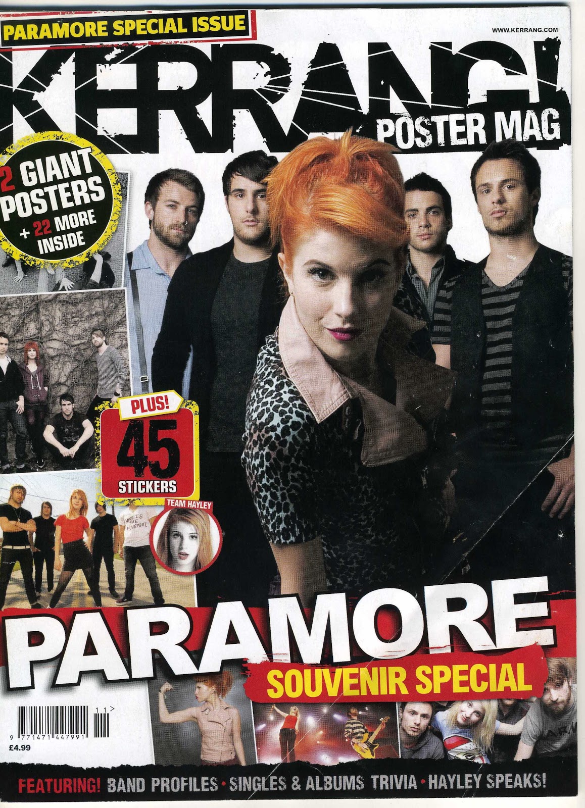 |
Masthead: The Kerrang masthead in a bold black font is very distracting due to the rough outline and the white lines going through the black. Main Image: The main image is of a band called Paramore. The image reflects to the reader who the main artist is in the band, this is the girl. Due to the remaining four members being behind the girl it suggests to the reader that it is in fact herself who is the lead singer with perhaps the men as the band. Splash: The is no Pull Quote or main story title indicated on the front cover however there is 'Paramore' which acts as the strapline due to it being in large capital letters wrapping across the width of the page. The word Paramore is in a bold white colour which has a red background. The colours red and white work well together to catch the readers attention. Pug: There a number of pugs on the front cover of the magazine. On the top left corner, above the masthead it has 'Paramore special issue' Written in bright yellow writing on black background. Yellow and black are colours which work well together to highlight the writing. Due to it stating 'Special issue' this again attracts the reader to the magazine as they want to see what is special about it, it would result in them purchasing the magazine. The front cover also has 'poster mag' and '2 giant posters plus more inside'. Evidently Kerrang's readers like a lot of posters in the magazine due to it being offered twice on the front cover. Subsidery images: The subsidery images located below the '2 giant posters' pug are to show the reader what the posters look like and who they are of. I believe Kerrang magazine would appeal to mostly men aged 20-50 who listen to rock/ indie music. I personally do not like the whole layout of Kerrang magazine, or the fonts and colours used. I like magazines which are simple and effective. Kerrang has too many subsidiary images for my liking. |
 |
Masthead: The NME masthead is located in the top left corner of the magazine, this is a common location for the masthead. Additionally, the blocked capital font and also the white lettering stands out the reader. It also co-ordinates well with the colour theme of black, red, white and blue.
Caption: The Caption under the main image is the Splash, and below it in large lettering is Lana Del Rey. Lana is the girl in the main image and therefore her name being stated in large, bright blue, capital lettering shows the reader who the story is on.
Main image: I am very fond on the main image, it shows that Lana is a fun, carefree person due to her sticking her tongue out to the readers. Additionally, NME have used an attractive girl on the front cover as I have found out that their main target audience is men aged 23 and above. Therefore, men enjoy looking at attractive women, which would again lead them on purchasing the magazine. The image is a medium close up shot, showing the top half of Lana's body. Her eyes are looking directly at the camera. This creates a relationship between the reader due to the direct eye contact. The American flag background is to show the reader that Lana is in fact an american singer but the flag also acts as colour to again attract the readers attention to the magazine.
Splash: The main story of the magazine is extremely eye catching to the reader as it is spread across the width of the magazine, it is a Strapline. It is also at a slight slant which can be distorting to the eye, another thing which catches peoples attention to the magazine. The "I'm a psycho!" pullquote again catches the readers attention due to it being something which people would find interesting to read about which would result in the magazine being purchased. NME editors are evidently extremely knowledgable on how to catch readers attention.
Sell Line: The sell lines include information on stories regarding Noel Gallagher. Therefore, there's articles and information for people who may not be interested on the main story. There is also new tracks and album details on Pete Doherty. Additionally, there is a sell line on British band, Enter Shakari. The sell lines are to show the reader that there is something for everyone included in the magazine.
Pug: The pug, located in the top right corner of the magazine tells the reader that inside there are free posters inside!
Subsidiary Images: The Subsidiary Images are located in the top right hand corner, they are in black and white and coincide with the pug to show the reader what the posters to be won look like.
Footer Line: The information located across page show the reader that the magazine also includes gossip on bands such a Biffy Clyro etc.
|


 |
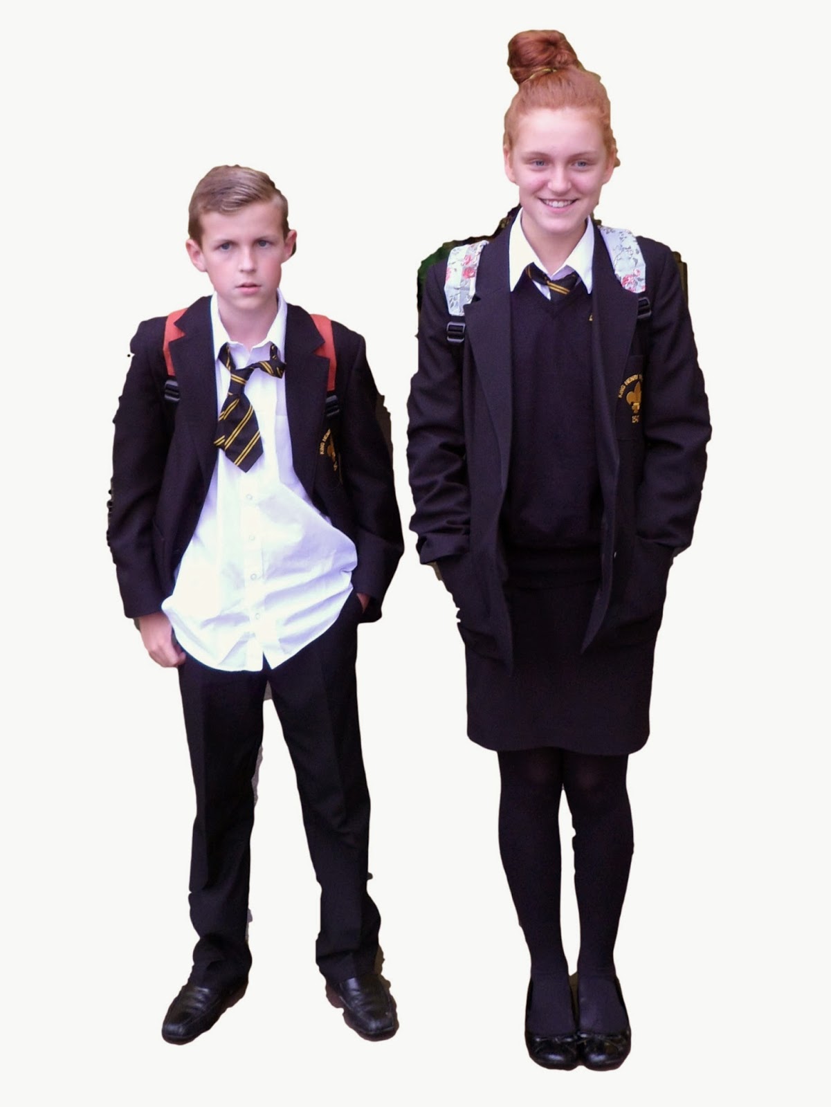
| I am pleased with this picture I took. Although the background is chaotic, and so leaves the picture to look untidy. However, the image it's self, when focusing only on Elliott and Megan, reflects the message I wanted to get across for my magazine. |
 |
| The above image, in my opinion, in terms of background and appearance is better than the previous one. However, Elliott is smiling, which i didn't particularly want for my front cover. This is because I want to show that for some pupils, school is abominable, but with Megan smiling it shows some children do find it enjoyable and want to learn. |
 |
| Again, this image in terms are background is improved than the first, although i'm not keep on Elliott's stance. In conclusion I have decided to use the first image shown, however with the background edited out to keep the image simple but effective. |

| ||
| This is my main image, although it is colourless and an extremely awful/ rough drawing, i have included the facial expressions which will be shown on my final, main image. It will show the emotions two pupils from King Henry school feel in relation to school uniform. As you can see, the stereotypical boy is untidy with an unhappy face, showing he doesn't like or agree with school uniform. Whereas, the girl in the picture will be happy wearing school uniform and well presented. The main image is also in correlation with the Splash, regarding school uniform. |
 |
| As for the pug, located in the top right of the magazine, i one again have used black to outline the colour yellow as it forces the writing to stand out more, to catch the readers attention to purchase the magazine to enter the competition. |
 |
| The above picture is the sell line for my front cover, subheadings to tell readers the stories that will be inside the magazine. I have used relevant headings which are memorable and interesting to the reader, teenagers like gossip and showing the subheadings included, especially regarding teachers will attract the pupil to purchase the magazine. |
 The brightness of the yellow then make it more eye-catching. 
Above is my Subsidiary Image to represent the range of other stories in the magazine. Where the blank boxes are, there will be pictures of a chess board and a range of the schools sports equipment, to interest keep sports or chess players, the magazine wont only target people interested in reading.
 The Uniform Debate is my Splash for the magazine, the main tory for my magazine, which my Main Image is also based off. I have used the colour to highlight the Pros & Cons, to show my magazine will be debating whether school uniform is necessary. The Pull Quote below the Splash, are quotes used by pupils when debating over school uniform. Hopefully, my final front cover will be successful and more appealing than my draft above! |


