 |
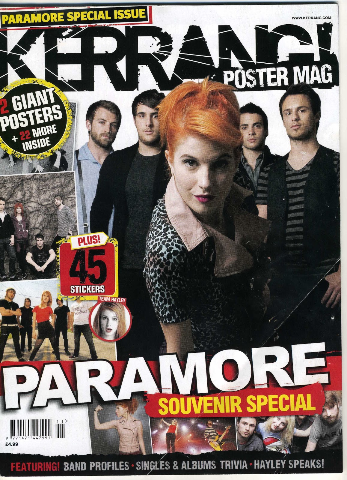
Masthead: The Kerrang masthead in a bold black font is very distracting due to the rough outline and the white lines going through the black. Main Image: The main image is of a band called Paramore. The image reflects to the reader who the main artist is in the band, this is the girl. Due to the remaining four members being behind the girl it suggests to the reader that it is in fact herself who is the lead singer with perhaps the men as the band. Splash: The is no Pull Quote or main story title indicated on the front cover however there is 'Paramore' which acts as the strapline due to it being in large capital letters wrapping across the width of the page. The word Paramore is in a bold white colour which has a red background. The colours red and white work well together to catch the readers attention. Pug: There a number of pugs on the front cover of the magazine. On the top left corner, above the masthead it has 'Paramore special issue' Written in bright yellow writing on black background. Yellow and black are colours which work well together to highlight the writing. Due to it stating 'Special issue' this again attracts the reader to the magazine as they want to see what is special about it, it would result in them purchasing the magazine. The front cover also has 'poster mag' and '2 giant posters plus more inside'. Evidently Kerrang's readers like a lot of posters in the magazine due to it being offered twice on the front cover. Subsidery images: The subsidery images located below the '2 giant posters' pug are to show the reader what the posters look like and who they are of. I believe Kerrang magazine would appeal to mostly men aged 20-50 who listen to rock/ indie music. I personally do not like the whole layout of Kerrang magazine, or the fonts and colours used. I like magazines which are simple and effective. Kerrang has too many subsidiary images for my liking. |
Monday, 18 November 2013
Analysis of music magazine front cover 2: Kerrang
Subscribe to:
Post Comments (Atom)
No comments:
Post a Comment