Thursday 17 October 2013

COMPLETED SCHOOL MAGAZINE COVER


This is the final draft for my school magazine front cover and I am pleased with the outcome. Understandably it wont be my best piece of work due to it being my attempt in using Adobe InDesign software.

Below is the finished masthead for my magazine cover. As you can see the main image covers part of the masthead which I like. I think it makes the magazine look more professional. However, I do however think I could've chosen a better, more appropriate or catchy masthead as mine is pretty basic. Additionally, the masthead colour scheme fits well with the whole of the magazine however, now i think the colour scheme of grey, white, yellow and black is slightly tacky. It also doesn't catch your eye as much as most magazines. Therefore, when designing my music magazine front cover I will use different colours. Perhaps the colour red instead of yellow and I don't think i'll have the colour grey on the magazine and it forces it to look more dull and drab.

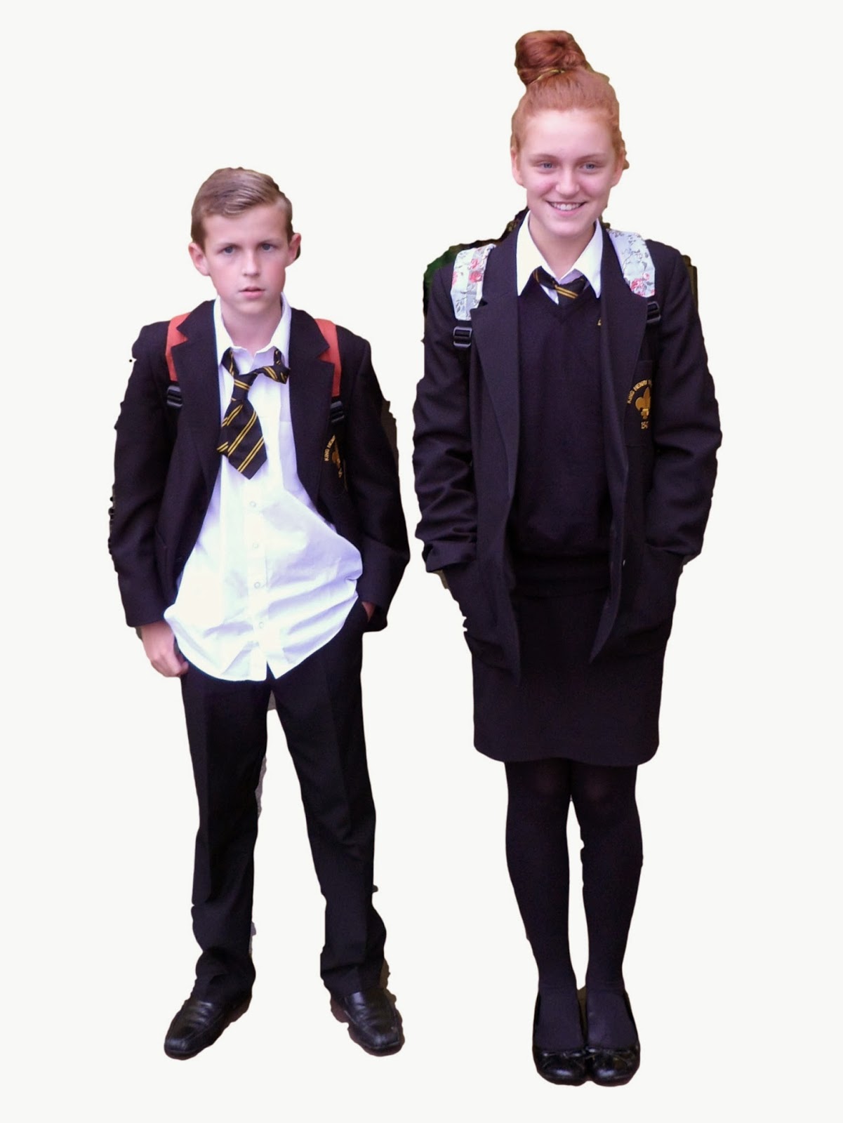
The main image for the front cover is the original, edited version which I have done a blog post on below. I was unsure whether to re-edit the picture to soften the edges, however when I placed the picture onto my front cover I realised I could blur the outer edges of the picture to hide my poor editing of removing the background. I am pleased with the main image, it is an appropriate size and I believe it gives a clear indication of the story regarding school uniform which it is representing.

In relation to my magazine front cover, I think the subsidiary images are an appropriate size and they have been placed in a grid-like structure so they are in an appropriate position on the page. I also believe the images give a clear indication of the story they are representing. 


Saturday 5 October 2013

Below is the before and after image for my front cover.


Here is the edited picture for my front cover of my magazine. I have edited the background out using, an online editor called clipping magic. Although it has taken away the background of the picture, the cut isn't very clean or precise. Therefore, before putting this image onto my front cover, I think I will re-edit it and see if the outcome is any better.

Picture options for magazine cover

Here are the pictures I have taken as options for the front cover of my magazine. 
The pictures are of Elliott Reynolds and Megan Spears. 
I asked Elliott to untuck his shirt and loosen his tie to show that pupils don't always follow the school uniform rules, minors are often deviant to look 'cool' and gain status. In schools, children often break rules to be seen as superior and gain friends. Therefore I wanted Elliott to reflect deviance that goes on within schools.
As for Megan, I wanted her to look cheerful and smart to show that although there are unruly peers in school, most children do in fact follow rules and present a good image to the school.
I am pleased with this picture I took. Although the background is chaotic, and so leaves the picture to look untidy. However, the image it's self, when focusing only on Elliott and Megan, reflects the message I wanted to get across for my magazine.
The above image, in my opinion, in terms of background and appearance is better than the previous one. However, Elliott is smiling, which i didn't particularly want for my front cover. This is because I want to show that for some pupils, school is abominable, but with Megan smiling it shows some children do find it enjoyable and want to learn.

Again, this image in terms are background is improved than the first, although i'm not keep on Elliott's stance.

In conclusion I have decided to use the first image shown, however with the background edited out to keep the image simple but effective. 

Thursday 3 October 2013

School Magazine cover progress

Below is how far I have come in creating my front cover for my magazine.
As you can see, from looking at my previous blog post of the draft for this front cover I have changed my original idea which was going to have both a banner and footer line, however when making this I decided the magazine looks better with only a footer line. 
I have stuck with my decision of using the colours black, grey, white and yellow and i'm pleased with the outcome. The contrast with each of the colours used make the main points stand out which i'm pleased about!
Once i've added my final image to the front cover and also the subsidiary images I will see how the final outcome looks, then see if there are any aspects i need to change.

Tuesday 1 October 2013

School paper front cover analysis (draft)

Above is my draft of a school front cover. My colour scheme is  I have used the coloured black, white and yellow as the contrast between the black and white make the front cover stand out, also because they are the school colours.
This is my main image, although it is colourless and an extremely awful/ rough drawing, i have included the facial expressions which will be shown on my final, main image. It will show the emotions two pupils from King Henry school feel in relation to school uniform. As you can see, the stereotypical boy is untidy with an unhappy face, showing he doesn't like or agree with school uniform. Whereas, the girl in the picture will be  happy wearing school uniform and well presented.
The main image is also in correlation with the Splash, regarding school uniform.

As for the pug, located in the top right of the magazine, i one again have used black to outline the colour yellow as it forces the writing to stand out more, to catch the readers attention to purchase the magazine to enter the competition.
The above picture is the sell line for my front cover, subheadings to tell readers the stories that will be inside the magazine. I have used relevant headings which are memorable and interesting to the reader, teenagers like gossip and showing the subheadings included, especially regarding teachers will attract the pupil to purchase the magazine.  


This is what I plan on my masthead to look like. I came up with the idea of KHS Deviations which is King Henry School's initials and 'Deviations' is all the related issues which come out of the school. Such as, pupils going against the school norm of uniform, pupils breaking rules and  then how to enforce boundaries. Therefore, all school related issues which will be covered on the magazine.
The brightness of the yellow then make it more eye-catching.


Above is my Subsidiary Image to represent the range of other stories in the magazine. Where the blank boxes are, there will be pictures of a chess board and a range of the schools sports equipment, to interest keep sports or chess players, the magazine wont only target people interested in reading.


The Uniform Debate is my Splash for the magazine, the main tory for my magazine, which my Main Image is also based off. I have used the colour to highlight the Pros & Cons, to show my magazine will be debating whether school uniform is necessary.
The Pull Quote below the Splash, are quotes used by pupils when debating over school uniform.


Hopefully, my final front cover will be successful and more appealing than my draft above!